§ 00Brand kit
Everything that gives us our shape.
Logos, colors, type and the rules that hold them together. Use this kit whenever you write about Code Aakar, design for us, or put us on a banner.
- Version
- 1.0 · September 2026
- Display type
- Unbounded Bold
- Primary color
- Celadon #42D728
- Ink
- Celadon 950 #091E06
§ 01Logo
Four shapes, one idea.
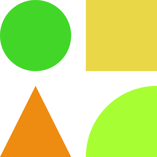
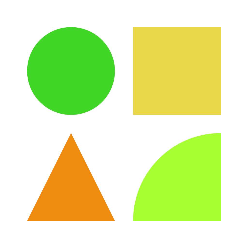
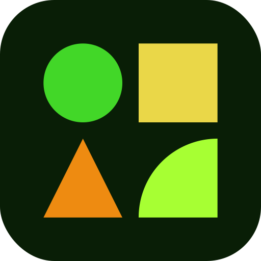
The mark is a 2×2 grid of our building blocks. Read together, they show an idea taking shape. The wordmark pairs a lowercase code in Geist Mono with aakar in Unbounded Bold.
Primary lockup & clear space
x = the width of one shape in the mark. Keep at least x clear on every side.
Color variations
The mark
Circle
The idea — a point to start from
Square
The team — structure and support
Triangle
The build — direction and momentum
Quarter circle
The ship — motion, out into the world
Minimum size
Mark: 20px — below this the shapes blur together.
Lockup: 96px wide — switch to the mark alone if smaller.
Please don't
§ 02Color
Bright on paper.
A white canvas, dark ink, and a handful of loud colors used with intent. Click any swatch to copy its hex code.
Core palette
Color ratio
- Paper 60%
- Ink 20%
- Celadon 8%
- Lime Cream 6%
- Golden Glow 4%
- Ochre 2%
Roughly how much of a layout each color should cover. Paper and ink do the heavy lifting; the bright colors are accents.
Full scales
Celadon
Primary
Our core green. Primary actions, progress, and anything that says go. Celadon 950 is our ink.
Lime Cream
Highlight
The electric accent. Marker highlights, primary buttons and live states — use it like a highlighter, not a paint roller.
Golden Glow
Secondary
Warm support colour for banners, callouts and illustration. Pairs with ink, never with white text.
Ochre
Accent
Energy in small doses. Shapes, illustration and emphasis — not for body text or large fills.
Lemon Lime
Extended
Reserved for campaigns and special events, where we want something that breaks from the everyday.
Accessible pairings
| Sample | Text on background | Contrast | WCAG |
|---|---|---|---|
| Aa | Ink on Paper | 17.50:1 | AAA |
| Aa | Celadon 800 on Paper | 8.81:1 | AAA |
| Aa | Ink on Lime Cream 400 | 14.16:1 | AAA |
| Aa | Ink on Celadon 500 | 9.15:1 | AAA |
| Aa | Ink on Golden Glow 400 | 11.93:1 | AAA |
| Aa | Ink on Ochre 500 | 6.95:1 | AA |
| Aa | Lime Cream 400 on Ink | 14.16:1 | AAA |
| Aa | Paper on Celadon 500 | 1.91:1 | Fail |
| Aa | Paper on Ochre 500 | 2.52:1 | Fail |
Rule of thumb: bright brand colors always take ink text, never white.
§ 03Typography
Loud headlines, quiet body.
A wide, geometric display face for impact, a clean sans for reading, and a mono for the drafting-table details. All four are free on Google Fonts.
Typefaces
Aa
Display
Unbounded
Bold 700
Headlines, card titles, the wordmark's aakar.
Aa
Body
Geist
Regular 400 · Medium 500 · Semibold 600
Paragraphs, UI text, anything longer than a line.
Aa
Labels & code
Geist Mono
Medium 500 · Semibold 600
Section labels, metadata, buttons, code. Usually uppercase.
आ
Devanagari accent
Rozha One
Regular 400
Only for आकार — the one word we set in Hindi.
Type scale
Display
Unbounded Bold · 40–88px · tight
Give your idea its shape
Heading
Unbounded Bold · 48px
On the drafting table.
Title
Unbounded Bold · 24px
Registrations & teams
Body large
Geist Regular · 20px / 1.6
Find a hackathon, form a crew, and ship something real.
Body
Geist Regular · 16px / 1.6
Mentors drop in, checkpoints keep you honest, and the chai doesn't stop.
Label
Geist Mono Medium · 12px · caps · 0.2em
§ 01 — Upcoming hackathons
§ 04Shapes & graphics
Building blocks.
Six flat shapes do most of our illustration work. Overlap them, crop them off the edge, rotate them a little — but keep them solid, flat and geometric. No gradients, no bevels.
Shapes
Circle
Square
Triangle
Half circle
Quarter circle
Diamond
Graphic elements
§ 05Components
Pieces we reuse.
The same small set of parts shows up everywhere. Build new screens from these before inventing anything new.
Buttons
Lime fill. The one action we most want you to take.
Paper fill. Alternatives that sit next to a primary.
Ink fill. For use on lime, golden or celadon backgrounds.
Labels, tags & status
§ 01Section label
Opens every section. Numbered like a drawing set.
- AI & ML
- FinTech
- Open Source
Tags for tracks and topics. Thin border, mono text.
Status pills. The pulsing dot means something is live.
§ 06Voice & naming
Builder to builder.
We sound like the most helpful person at the hackathon — the one who's shipped before and wants you to ship too.
Principles
01
Plain over clever
Say what happens. If a first-time hacker wouldn't get it, rewrite it.
02
Short and direct
Short sentences. Active verbs. One idea per line when we can manage it.
03
Warm, never hype
We're builders talking to builders. Encouraging, a little playful, never salesy.
We say / we don't say
Ship something real in a weekend.
Leverage cutting-edge synergies to accelerate innovation.
Bring the rough idea you've been sitting on.
Submit your disruptive concept for evaluation.
Beginner friendly.
Suitable for participants across all experience levels.
Writing our name
Two words, both capitalized. The only place we go lowercase is inside the logo itself; in URLs and handles, code-aakar is fine.
- Code Aakar
- CodeAakar
- Code Akar
- CODE AAKAR
- code-aakar
§ 07Downloads
Take it with you.
Drop these straight into slides, posters and social posts. SVG scales to any size, PNG keeps a transparent background, and JPG comes on a solid one — white, or ink for the white versions.

Need something that isn't here?
A vector version of the full logo, co-branded lockups, press or event kits — get in touch and we'll sort it out.